English | MP4 | AVC 1280×720 | AAC 48KHz 2ch | 1h 52m | 643 MB
With all the web design software available, why would you design in the browser? We are living in a brave new world of responsive design. Websites can be read on mobile devices, tablets, desktops, and even on the smart watches on our wrists. Most static web design tools don’t account for that. The browser is an endless, flexible canvas. It’s a natural place to code, and its dynamic design surface and instant feedback allows for more responsive web designs.
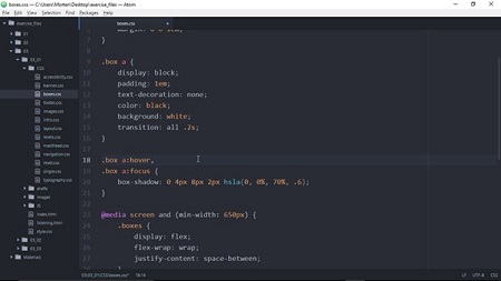
In this course, Morten Rand-Hendriksen explains his approach to designing in the browser, which starts well before he even starts coding. He shows how to define the layout on paper and create a “language” for the site, and then builds a baseline document with HTML5. Then he uses CSS to guide the look of the site and the layout, using media queries and Flexbox to add responsive behaviors. In chapter 3, Morten improves the site’s interactivity using CSS transitions and transforms. Finally, he reveals how to use these techniques to build WordPress themes in the browser.
Each step involves design strategies, best practices, and actual code examples that will turn the web browser into your new favorite design tool.
Topics include:
- Use the browser as a design canvas
- Draft layouts with pen and paper
- Modularizing the design
- Create a baseline document with HTML5
- Create responsive layouts with Flexbox
- Applying CSS transitions and transforms
- Building WordPress themes in the browser
Resolve the captcha to access the links!