English | MP4 | AVC 1280×720 | AAC 48KHz 2ch | 1h 11m | 342 MB
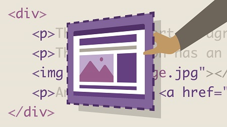
Based on old-school typography blocks, the CSS box model is the key to modern web design. Once you master it, you can build any layout you want—and troubleshoot most of the common CSS alignment and positioning woes. In this course, Morten Rand-Hendriksen offers a “four course meal” approach to the CSS box model, breaking it down into easily digestible chunks. He covers techniques such as styling text and images, floating content, using display properties, and positioning elements. He also explores the brave new world of modern layout modules, discussing Float, Flex, and Grid and how they can work together. Each lesson is supported by real-world demonstrations of the concepts in action, and Morten closes with a “nightcap” that will get you thinking about going further with CSS.
Topics include:
- Designing with boxes
- The origin of the box in typography
- What is the CSS box model?
- Changing the contents within the box
- Floating and clearing content
- Using the clearfix
- Working with Float, Flex, and Grid
- CSS shapes
Table of Contents
Introduction
1 Making sense of the CSS Box Model
Appetizer The Web Is Made of Boxes
2 Displaying information through the web
3 The web is made of boxes
4 Designing with boxes
Entrée The Origin of the Box in Typography
5 Understanding the basics of type
6 Change the type, change the box
7 Text flow in the box
Main Course Understanding the Box Model
8 What is the CSS Box Model
9 Changing the contents within the box
10 Understanding the display porperty
11 Sidebar Images are inline elements
12 Position is everything
13 Floating and clearing content
14 Using the clearfix
15 Pseudo elements Making the browser hallucinate
Dessert The Brave New World of Layouts
16 Modern layout modules
17 Flex Content-based layouts
18 Flex in depth
19 Grid Layout-based layouts
20 Grid in depth
Nightcap
21 Shapes
22 Going further with CSS and web standards
Resolve the captcha to access the links!